- +1 (778) 227 - 1004
- info@afkmedia.ca
- Vancouver, BC V6B 2Z4

Composition Tips to Make Real Estate Photos Stand Out
Introduction Composition is what turns a “nice” room into a scroll-stopping image. Buyers don’t just see four walls, they sense how a space flows, where their eyes should travel, and…

Table of Contents
Introduction
Composition is what turns a “nice” room into a scroll-stopping image. Buyers don’t just see four walls, they sense how a space flows, where their eyes should travel, and what feels balanced. Strong framing helps a small condo read as open, a busy kitchen feel calm, and a great view become the hero.
This post is part of our full guide on how to take professional real estate photos. For a deeper walkthrough of the full workflow, see our guide to better real estate photos.
Key Takeaways
- Composition makes rooms feel open, balanced, and inviting.
- Use symmetry, leading lines, and smart camera height to guide the eye.
- Small adjustments at capture time often create the biggest visual gains.
Camera Height: Get It Wrong and the Room Feels Off
A consistent height gives viewers a familiar perspective, which is why chest-level is a reliable starting point. At roughly four to five feet, countertops look natural, furniture proportions make sense, and floors don’t dominate the frame. If you shoot too high, the room feels detached, like security-cam footage. Too low and everything skews cramped, with furniture looming and ceilings shrinking.
“Although opinions vary among professionals, most recommend placing your camera between four and five feet above the ground.”
Curated from HDRsoft
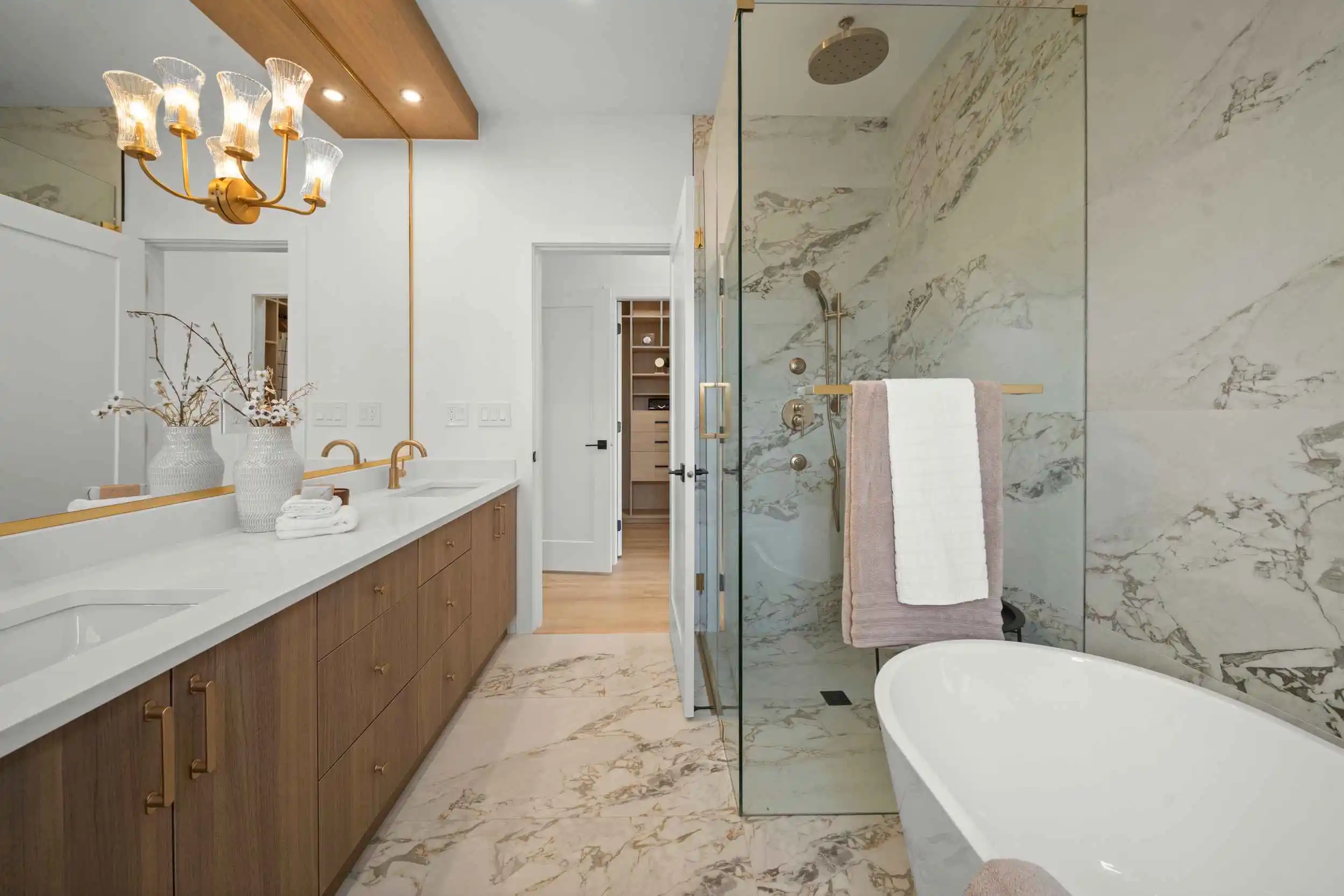
Set your tripod once, then move your feet. Use the in-camera level or grid and place a small tape mark on a tripod leg so you can return to the same height in each room. Kitchens often look best a touch above counter height, living rooms sit nicely near chest level, and bathrooms benefit from a slightly lower angle to keep vanities and mirrors clean in frame. If a room feels off, raise or lower two or three inches and reshoot from the same spot.

Frame from the Corners, Not the Middle
Shooting from a corner gives you instant depth. You’ll see more of the floor in the foreground, more wall-to-wall context, and a better sense of flow between zones. In living rooms and kitchens, a two-point perspective from the corner helps the viewer understand how the space connects, which usually reads as bigger and more inviting.
Corners also help you feature a clear subject: a fireplace, an island, or a view. Line up your leading edges, then leave a touch of “breathing room” around your hero element so it doesn’t crowd the frame. If you’re working in tight condos, micro-adjust a few inches at a time, then compare frames on your LCD. Wide-angle lenses amplify this effect, so be intentional about what you include at the edges.
Corners give more depth and wider coverage
From a corner, the viewer sees two planes meeting, which naturally adds dimensionality. It also reveals adjacent spaces without needing to move the camera much, a handy trick when you can’t step back farther.
Standing dead centre can flatten the room
A centred, one-point view is great for perfectly symmetrical scenes, but in most listings it compresses depth and hides layout. Save it for those rare, formal moments.
Experiment with angles in tight spaces
Bathrooms, dens, and entries reward micro-moves. Nudge left or right, then re-level and re-shoot. Compare three options before you leave the room.

Keep Vertical Lines Straight

Crooked door frames and leaning cabinets shout amateur. Keep your camera level left-to-right, then tilt as little as possible so verticals stay vertical. Use your camera’s grid or virtual horizon, and double-check the edges of the frame for any leaning walls. If you must tilt up or down, plan to fix perspective in post.
Crooked door frames = amateur vibe
Viewers may not know why a picture feels off, they just sense it. A slight lean breaks trust. Keep the sensor parallel to the wall and verify with in-camera guides or a hot-shoe level when needed.
Use the camera grid or in-camera level
Turn on gridlines so you can align jambs, tile grout, and cabinet edges. This simple habit prevents most perspective headaches and saves editing time later.
Fix perspective distortion in editing
Even with careful capture, some interiors need correction. In Lightroom Classic, the Transform panel’s Upright and Guided Upright tools straighten verticals quickly. Apply your lens profile first, then choose Auto, Vertical, or draw guides along door frames for a precise result.
“Using an incorrect lens or holding a shaky camera can cause the perspective of photographs to be tilted or skewed.”
Curated from Adobe
If you’d rather skip the learning curve and have a team handle capture and correction end to end, our real estate media services cover on-site shooting, lens-aware corrections, and consistent delivery across photo sets.
Use Symmetry and Balance

Symmetry calms the eye. When the bed, couch, or dining table sits centred in the frame, viewers instantly understand the room. Lines feel tidy, shapes feel intentional, and the space reads as more premium. Start by placing the lens on the room’s centreline, then nudge left or right a few centimetres until both sides carry similar visual weight. Watch headboards, nightstands, and lamps, since small misalignments show up fast.
Balance matters just as much as symmetry. If the left side of your image has a tall bookcase or a dark sofa, offset it with something that carries similar weight on the right, like a window or a floor lamp. You do not have to match objects exactly, you only need the frame to feel even. Negative space is your friend here. A clean patch of wall or open floor can give a feature room to breathe, which makes the entire photo feel lighter and more inviting.
Centre the bed, couch, or table when possible
- Align the furniture with the frame’s midpoint, then square the camera so verticals stay true.
- Keep equal “margins” on both sides. If a nightstand gets cut off on the left, consider trimming the right side the same amount for balance.
Balance left and right sides of the frame
- Think in terms of visual weight: dark colours, bold patterns, and tall objects feel heavier.
- If one side dominates, adjust your position or crop slightly to restore equilibrium.
Negative space can enhance flow
- Use open floor, blank wall, or sky through a window to prevent the scene from feeling crowded.
- Let hero pieces breathe. A centred table with airy space around it feels luxurious.

Lead the Eye with Lines and Light

Symmetry calms the eye. When the bed, couch, or dining table sits centred in the frame, viewers instantly understand the room. Lines feel tidy, shapes feel intentional, and the space reads as more premium. Start by placing the lens on the room’s centreline, then nudge left or right a few centimetres until both sides carry similar visual weight. Watch headboards, nightstands, and lamps, since small misalignments show up fast.
Balance matters just as much as symmetry. If the left side of your image has a tall bookcase or a dark sofa, offset it with something that carries similar weight on the right, like a window or a floor lamp. You do not have to match objects exactly, you only need the frame to feel even. Negative space is your friend here. A clean patch of wall or open floor can give a feature room to breathe, which makes the entire photo feel lighter and more inviting.
Use floors, countertops, beams as guides
- Align strong lines so they point to the feature, not to an exit or a dead corner.
- Avoid clutter near those lines. Busy edges create visual noise.
Draw the eye toward the room’s feature
- Decide on a single hero: fireplace, island, soaker tub, or view.
- Place it on a strong point in the frame, then use lines and decor to support it.
Light from windows can direct attention
- Shape the scene so the brightest area sits near your hero.
- Use sheers or blinds to soften contrast, and avoid mixed colour temperatures where possible.

Conclusion

Composition is the quiet edge that separates decent photos from the ones buyers remember. When camera height feels natural, verticals stay straight, and your framing adds depth, viewers can read the room quickly. They see how it flows, where to look first, and why the space works. Keep refining the same handful of habits: set a consistent tripod height, work the corners, square your lines, and balance the frame so the subject breathes.
Like any craft, this gets easier the more you practice. Do a quick three-shot routine in each room (corner A, corner B, centred symmetry) and compare them on the spot. Use lines and light to guide attention to the feature that sells: a fireplace, an island, a view, or a spa-like tub. Over time, your eye becomes automatic, and your galleries feel cleaner, bigger, and more premium.
Consistent, Polished Media for Every Listing

Want this handled for you so every listing looks consistent and polished? Our real estate media services cover on-site capture, perspective control, and editing that keeps rooms true to life. If you’d like to learn the full step-by-step process yourself, start with our guide to better real estate photos, then build a repeatable workflow for every shoot.
- Book a session with AFK Media to line up your next listing.
- Explore our portfolio to see how composition, lighting, and editing come together.
Say hello on social if you want quick tips or behind-the-scenes from real shoots around the Lower Mainland.
Latest posts
Popular Posts
Interviews, tips, guides, industry best practices, and news.
